Data Cleaning
Expert readers please note : this page has nothing to do with the popular "CLEAN" algorithm used in interferometry.
Most of the data in an HI cube tends to be noise. This can be from other sources that aren't the galaxies we're interested in (e.g. mobile phones, satellites, the Sun) or stray emission from the electronics. The emission we're interested in is very, very faint : we're trying to detect gas that's thinner than the most perfect vacuum ever created in a laboratory – by about five orders of magnitude – at a distance typically of millions of light years. Carl Sagan even reckoned that all the energy ever collected by radio telescopes from extrasolar sources amounted to less than that of a single snowflake hitting the ground, a claim which appears to be at least not wildly inaccurate.
So the techniques we use for processing the data really matter. I'm not going to go into the fundamentals of data reduction here, but the extra steps we apply to really milk the data as hard as we can. I'm also not going to go into well-known techniques like smoothing, though I do cover that on this page.
Recasting
Generally data reduction spits out the data in physical units (like flux) which we can use for analysis. But these units aren't always the most convenient for visualising the results. Survey sensitivity isn't always uniform : the edges especially tend to be of lower sensitivity. That means that the variation in the random noise there can be higher. A pixel at the edge might have a flux value three, four, five times or more higher than the typical pixels in the higher sensitivity regions of the data, just because the random variation of the noise is so much greater. So when we look at the data as a 3D volume, we see it surrounded by an inconvenient border of artificially brighter pixels.
Of course we could just cut this out, but a better approach is to recast the data in terms of signal-to-noise format. That is, for each spectrum in the data, we divide all the flux values by the rms of the spectrum. As long as the noise is approximately Gaussian, the absolute value of the rms doesn't matter : the variation in S/N values is the same. A pixel always has the same chance of having a S/N of three or four or whatever regardless of the actual noise value, which means this can completely eliminate the annoying border without sacrificing any data.

We can't use this new data for measuring total flux, however. And we have to remember that our sensitivity at the edges is still less, in terms of actual flux, than in the inner regions. But still, by reducing the dynamical range of the data values, we now have a chance of detecting sources at the edges that might have been invisible otherwise. This technique allows us to use the same colour transfer function (how the data values map to displayed colours) for data of variable rms; if we don't do this, the high variation at the edges can easily hide potential sources. If we don't mind the true flux sensitivity being variable and are more concerned about extracting as much as possible from the data, this is an easy and effective technique to try.
Better baselines
While we're measuring the rms values, it's a good idea to also figure out the shape of the baseline*. On the stacking pages you can see some example, idealised spectra which are just Gaussian noise, but even there, the typical level of the noise pixels isn't as close to zero as we might expect. These wiggles and ripples can be substantial, in the worse cases even being small enough to mimic real sources, but more often just raising large parts of the data above and below the overall average. As with the rms variation, this makes it difficult to spot sources if we always display it using the same colour transfer function.
* Not to be confused with the interferometric baselines, which refer only to the distances between antennas. "Spectral bandpass" is a more accurate term, but I'm mainly a single-dish astronomer and I'm gonna stick with the familiar.

We can fit a polynomial function to the baseline using regression techniques, and then subtract this model to make things nice and flat. As long as the model is on much larger scales than the sources, this is fine. For AGES we generally start with a 1st or 2nd-order polynomial (y=x^2) fitted to the whole 20,000 km/s of baseline (real sources have widths of 600 km/s at the absolute extreme). Then we split our cubes into chunks each of ~5,000 km/s spectral width just to make them easier to handle, and fit another 1st or 2nd-order polynomial to make them even cleaner. We seldom if ever use higher-order polynomials, they're just not needed and I don't trust 'em.
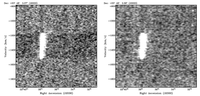
We can see the effects of this if we compare stacked versions of the cubes, before and after this fitting. That is, we make a map of the sum of all the pixel values along the line of sight. Here's the before and after results :

A spectacular difference ! But in one respect it doesn't help the sensitivity nearly as much as you might think : the second image has an rms only about 30% lower than the first. What's going on ?
Two things. First, this stacked image exaggerates the importance of this process. If we look at individual slices of the data, the artifacts we saw in the first image aren't nearly so prominent. When we're working with stacked or smoothed data to look for especially faint sources, this does matter, a lot, but for ordinary searching it's not actually that important.
Second, more interestingly, rms does not depend on order. If you were to take a list of Gaussian noise values and order them from highest to lowest, you'd see a very clear structure in the data, but the rms would be identical to the case of if they were randomly distributed. This means that rms gives you no indication of the presence of coherent structures. The baseline fitting is very good at removing coherent structures, but not so much for improving the actual noise level. More details are on my blog and, of course, brilliantly illustrated on the Datasaurus project website.
The really important point is that rms is not the whole story when it comes to sensitivity. It matters a great deal, but that's not all there is to it. Fitting baselines and recasting in S/N does improve our sensitivity, just not in a way that can be expressed by rms values !
Spatial bandpass
The spectral bandpass is important, but our data is after all three dimensional, so we shouldn't ignore the spatial bandpass either. AGES is a drift-scan survey, letting the sky pass overhead with the telescope pointed at a fixed altitude and azimuth. This means each scan is a swathe of Right Ascension at a fixed Declination angle. By default, our data reduction measures the median of the scan in Right Ascension and subtracts it.
Generally speaking this is good enough, since the emission we're interested in usually fills only a very small fraction of the scan. But on occasion, we might go through a bright, extended galaxy, and then the median value is not a good measure of the true noise value. This results in over-subtraction of the data, since we estimate the background noise to be brighter than it really is. Mary Putman (I believe) figured out how to overcome this : split the scan into several chunks, estimate the median of each, and then subtract either the minimum or median of these median values. It's very unlikely that all the scans would be significantly affected by bright extended sources, so this generally does an excellent job of getting rid of over-subtraction*.
* An extremely belligerent and annoying referee once insisted that these techniques have been superseded, but despite repeated questioning, absolutely refused to tell us what any of the improvements might be. As far as I'm concerned these are still perfectly valid methods.
Still, this does mean we reduce the precision of the measurements (which is distinct from the accuracy). The result is more easily-visible artifacts in the data, horizontal striations visible even in individual slices of the data. To try and overcome this I've experimented with a procedure I call USERMED. What this does is a take a version of the cube which the user has masked themselves, e.g. by manually specifying the exact locations of all sources and noisy regions (masking all sources is of course what FRELLED is good at). This maximises the amount of data available for estimating the median value of the bandpass.
In practise the significance of these artifacts is a bit hard to estimate. I've not found that they've ever strong enough to prevent detections, but they are certainly enough to affect measurements of the data, which can be important when searching for the faintest, most diffuse gas.
Working with multiple polarisations
Lastly, something a bit more experimental. HI data is generally recorded in two polarisations, each at 90 degrees to the other. We usually just make a cube that's the average of both as this has better sensitivity, but we can grid up the individual polarisations if we want . Since the HI signal is unpolarised, it should show up equally well in both (this is the basis of the automatic detection program GLADoS).
I've experimented with visualising the two polarisations in different ways, but only one method seems of any use : instead of averaging the two polarisations, we can multiply them. Consider the data in S/N format, and suppose we have a weak HI signal at a level of 2.0 in both polarisations. When we average them, the S/N only increases by a factor 1.4 (see the stacking page), but if we average them, it doubles. And this rises very quickly with increasing S/N : a source of 3.0 increases to 9.0, on one of 4.0 goes to 16.0, etc.
Because the noise is not correlated, this is not the same as simply multiplying the average cube by itself. A noise pixel may be a S/N of 2.0 in one cube but only -0.5 in another; the average may be above 1.0, but the multiplied value won't be. So the noise should, in principle, rapidly diminish whereas the sources should grow to huge brightness levels.
In practise the results were... promising-ish. This is something I played around with during my PhD and never pursued in any detail, and I didn't have all the other data cleaning techniques described above. It worked well enough, but had bigger problems with the faintest sources than I was hoping it would. One day I might return to this when I run out of other things to do.
******
So even before we get to data visualisation proper, we have a host of cleaning techniques for processing the data. We can recast into S/N, fit baselines on different scales, subtract the spatial bandpass in different ways, and even mess around with how we combine the different polarisations. An exasperated student once asked me the understandable question : which is the real data cube ?
The only answer I can come up with is this. There isn't one. There is only the cube most suited for answering the question you're interested in. A S/N cube is better for source extraction but worse for flux measurements; a bandpass-subtracted cube is better for dealing with bright extended sources but worse for measuring the faintest gas. And the same can be said, I think, for how we choose to render the data visually as well.